

To get detailed help please click on one of the following topics. You can also scroll though the list to find new features and learn more about the budget planning tool MyMicroBalance.
First Steps
Analysis
Main User Interface
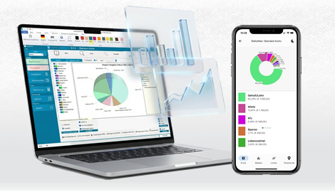
Charts make receipts, expenditures, carryovers, and individual categories visible at a glance. In the current version, open the Chart tab. Depending on your license and selected view, MyMicroBalance provides bar, line, and pie charts as well as additional VIP analyses.
Select the required chart type in the first control. Depending on the view, you can create bar, line, or pie charts. Use the second control to choose the values to display, such as receipts, expenditures, or carryover. The chart-type selector provides access to the available analyses.

The monthly receipts/expenditures view shows the selected month's values over time. Bar charts are useful for individual daily values; line charts make the development throughout the month easier to follow. If you change the year, month, or displayed side of the Balance Sheet, MyMicroBalance rebuilds the chart accordingly.
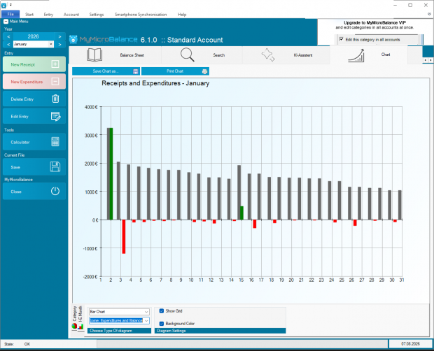
Depending on the chart type, the following options are available:
In a category view, you can see which receipt or expenditure categories account for the largest shares. Select individual categories on the left or choose all categories to display the complete distribution. Pie charts are especially useful for shares; bar charts make absolute values easier to compare.
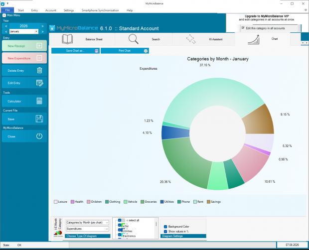
Click Save chart as... to save the current chart as an image file for later use. Click Print chart to print the current analysis. Creating, saving, or printing a chart does not change any entries in your MyMicroBalance file.
Additional chart types and more detailed analyses are explained under VIP Charts.

 1
1 2
2 3
3 4
4